Artist Manager CAMD Logo with Blue on White Background
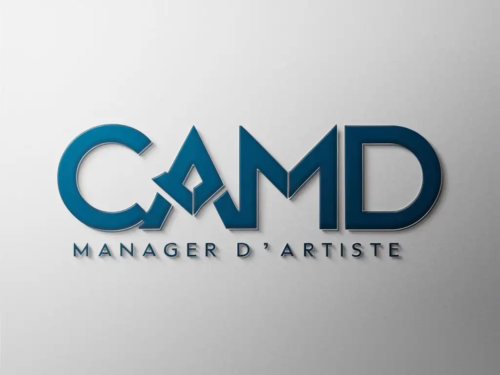
Image Prompt
Prompt
Je veux un logo de manager d'artiste avec ces lettres C.A.M.D,
colleur bleu sur du blanc
Model: visiCanvas
Ratio: 4:3
Related AI Images







Related Tags
Prompt Analyze
- Subject: The logo design should encapsulate the essence of artist management with an emphasis on the acronym CAMD. The letters should be stylized to convey a sense of creativity, professionalism, and modernity, which are key attributes of the artist management industry. Setting/Background: The logo will be set against a clean, white background to ensure that the blue color of the letters stands out prominently. This contrast will not only make the logo visually appealing but also ensure that it is easily recognizable and memorable. Style: The style of the logo should be sleek and minimalist, with a focus on typography and letterform design. The letters could be connected in a way that subtly hints at the interconnectedness of an artist and their manager, symbolizing the collaborative nature of their relationship. Coloring: The blue color used for the letters should be a modern, vibrant hue that communicates trustworthiness, reliability, and creativity. It's important that the blue shade is consistent across all applications of the logo to maintain brand recognition. Action/Items: The logo should be designed in a way that it can be used across various platforms and mediums, from business cards and letterheads to digital banners and social media profiles. It should be scalable and adaptable without losing its clarity or impact. Costume/Appearance: The letters of the acronym should be the primary visual element of the logo, with no additional characters or numbers that could detract from the brand message. The appearance of the letters should be uniform yet distinctive, ensuring that the logo is both cohesive and memorable. Accessories: While the focus is on the letters, subtle design elements such as a connecting line or a small emblem that represents the artist management profession could be incorporated to add depth and meaning to the logo without overwhelming its primary purpose.