Cluttered vs Sleek Website Interface A Visual Comparison
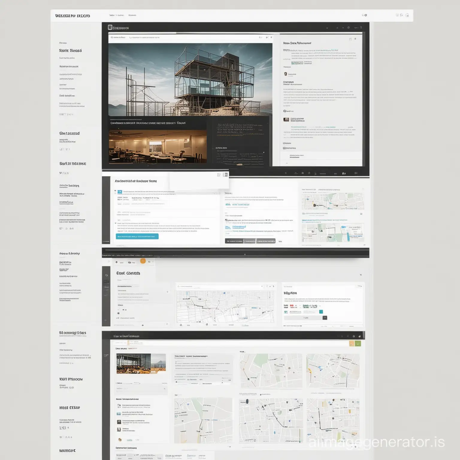
Image Prompt
Prompt
Design a split-screen graphic that contrasts between a poorly designed website interface and a sleek, user-friendly interface. On one side, depict cluttered layouts, confusing navigation, and outdated design elements. On the other side, showcase a clean, intuitive design with clear navigation, visually appealing aesthetics, and seamless user experience.
Model: realistic
Ratio: 1:1
Related AI Images


Related Tags
Prompt Analyze
- Subject: The split-screen graphic will vividly illustrate the stark differences between a poorly designed website and its well-crafted counterpart. On the cluttered side, the subject matter will include overlapping elements, tiny fonts, and a cacophony of colors that overwhelm the viewer. There will be too many drop-down menus, pop-ups, and flashing ads that distract from the core content. Setting/Background: The backdrop of the cluttered interface will be a mishmash of patterns and gradients, creating a visually jarring environment. In contrast, the sleek interface will feature a minimalist, white-space-rich background that enhances readability and focus. Style/Coloring: The style of the cluttered side will be characterized by outdated design trends, such as clip art images and pixelated icons. The sleek side will employ modern design principles with smooth, vector-based graphics and a harmonious color palette that guides the user's attention. Action/Items/Costume/Appearance: On the cluttered side, the user's action is hindered by a maze of irrelevant items and confusing CTAs (Call-to-Actions). The sleek side will present clear, concise CTAs and easily identifiable buttons that align with the user's intent. Accessories: The cluttered side will be adorned with unnecessary widgets and outdated plugins, while the sleek side will have streamlined, functional accessories that enhance the user experience without detracting from it. In conclusion, this split-screen graphic will not only serve as a powerful visual representation of good and bad web design but also as a guide for web developers and designers on what to avoid and what to strive for in creating user-friendly and aesthetically pleasing websites.